Branding: The Future of Energy
11 Sept 2023
TFE Energy, as it used to be called (this is the old logo), has a thriving consultancy in South Africa, composed of investment experts, electrical and software engineers, electrification experts and economists. It works with the biggest organisations in the world – the UN, World Bank, you name it – to serve energy access and electrification across the continent of Africa. But while working on the branding for Superpower Africa Fund, I felt that the ‘mother brand’ of TFE could do with some work.
It had built a great reputation over the years, and we didn’t want to waste all that brand equity – but we needed to add more meaning and a vision to help futureproof the brand and instantly tell people our ‘why’.

And so, The Future of Energy was born.
Still TFE, but with meaning.

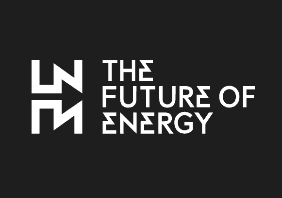
Working with a group of talented designers, we created a bold logo, inspired by ancient African symbols, and subtly inferring electrification through the distinctive ‘E’. You might also have spotted the arrow in the white space (in this version of the logo, black space) which places emphasis on the future focus of the brand. As clients hire TFE for their knowledge and understanding of the latest trends, this shift was tailored to their business and funding a model – a key component in successful branding. Check out how the web team use the brand icons, language logo throughout their awesome website. Check out The Future of Energy
